Introducing Bloomfire Spark, a New Interface to Drive Knowledge Engagement

We’re officially pulling back the curtain on our new interface, Bloomfire Spark. Our team has been hard at work making enhancements to the search, customization, and content viewing experiences in our knowledge engagement platform, and we’re excited to share the final product with our customers.
The goal behind the new look and feel of Bloomfire Spark is to make it as easy as possible for our users to navigate, engage with, and discover their company’s collective knowledge in all its formats. “We developed Bloomfire Spark to help users maximize the value of their time in the platform,” says Joah Gonzalez, Bloomfire’s Director of Product. “We’ve created a modern interface that looks and feels similar to consumer apps, making it simple for end users to tap into and contribute to their company’s knowledge while also making it easier for admins to manage that knowledge. By simplifying the processes of accessing and sharing content, we’re encouraging users to engage more deeply with the collective knowledge of their organizations.”
So what’s new with Bloomfire Spark? Check out some of the most notable enhancements below.
Improved Search Experience
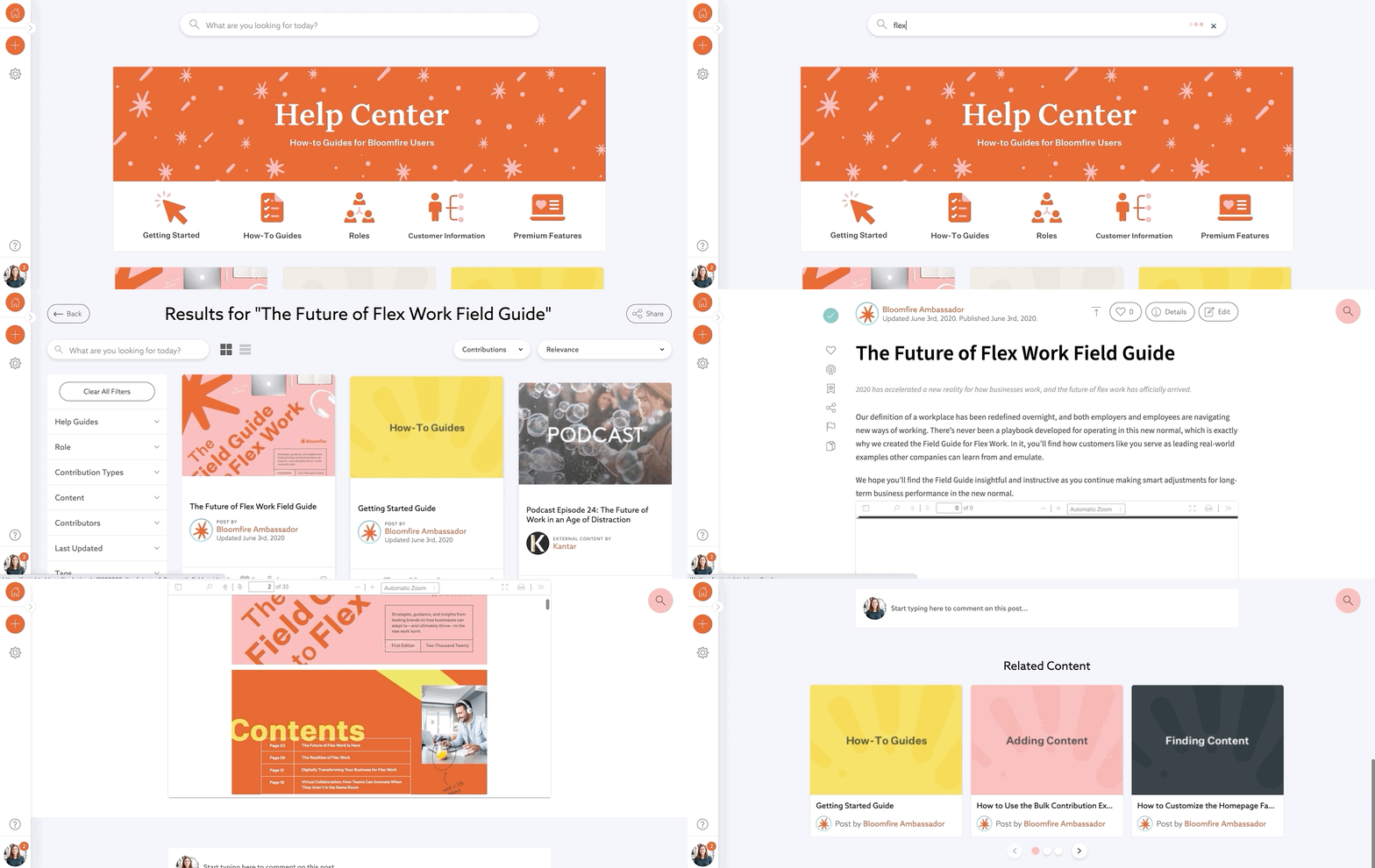
Search is the core of Bloomfire, and we’re committed to optimizing the search experience so that users can quickly find the information they need to do their best work. One major improvement we’ve made with Bloomfire Spark is the introduction of search suggestions.
Search suggestions now appear as a user is typing, and if their search terms appear in the titles of any contributions, those contributions will appear in the search suggestion list. This helps reduce the cognitive demand of searching, as users can simply start typing and recognize the right phrase or title from the drop-down search suggestion list.
Advanced Branding and Customization Options
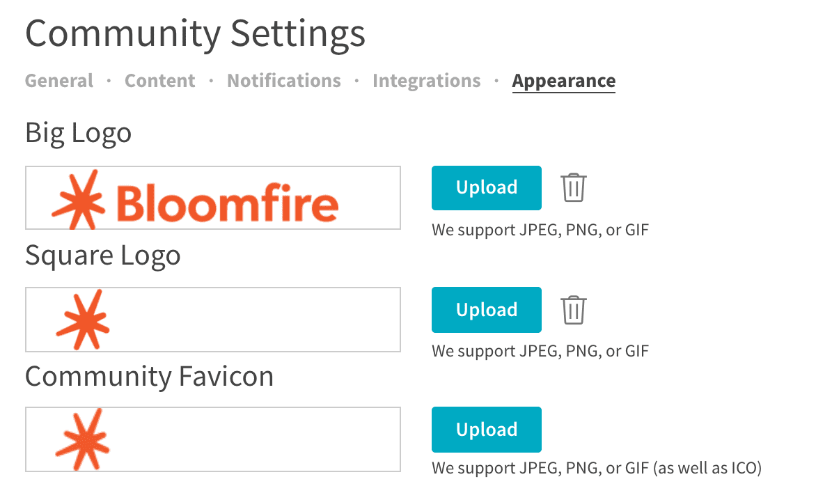
We’re introducing new branding options that allow admins to easily customize their communities with their logos and brand colors (no coding required). The goal behind these enhancements is to allow admins to create a knowledge engagement community that feels familiar and personal to users, whether it’s customized to align with their company branding or given its own unique brand and logo. By creating a delightful, customized experience, admins can encourage their end users to engage more deeply with the knowledge in their Bloomfire community.
Enhanced Contribution Pages
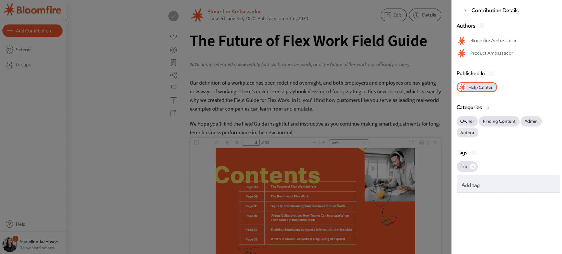
We’ve redesigned our contribution pages to create a better viewing experience for users and make it easier to quickly digest information. One of the first things users are likely to notice is that there’s more information about contributions available at the top of each contribution page. Users can click the Details button at the top of the page to open a sidebar menu showing the contribution’s author(s), tags, categories, and the community or communities in which it’s published.
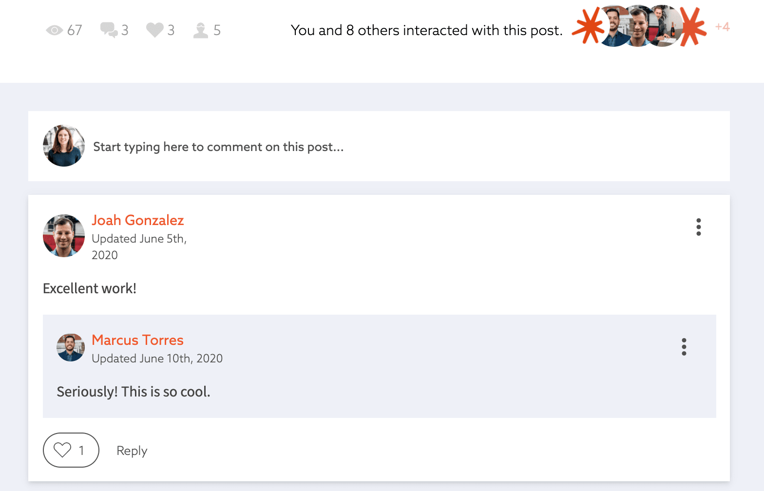
We’ve also redesigned the comments section at the bottom of contribution pages to make it more prominent and encourage users to add related notes, feedback, or questions for clarification. Users can also reply to specific comments, creating a comment “thread” that makes it simple to visually delineate different topics and conversations.
Dynamic Content Viewing
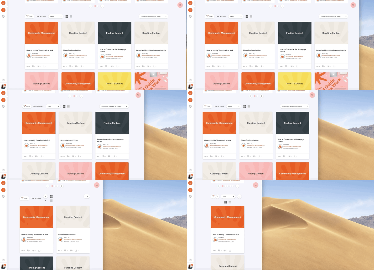
We’ve made some changes to our responsive design so that the content users see will be optimized for their device and browser. The number of preview cards per row will automatically adjust based on the browser window size, going from a minimum of one to a maximum of six. The cards themselves will not change in size; only the white space between cards and the exterior space beyond the cards will adjust. We’ve made these changes to help provide an excellent viewing experience on any device and to allow users to access their company’s knowledge from anywhere, whether they’re working at home with a large desktop monitor or are on the go and using their phone.
We hope that our customers are able to take advantage of the latest enhancements in Bloomfire Spark to help their end users to digest and engage with their organization’s collective knowledge.
If you’re not a customer yet and you’d like a closer look at Bloomfire Spark, we’d be happy to give you a tour. Schedule a demo today.

Knowledge Management Cycle: From Theory to Real-World Implementation

Why SharePoint Cleanup Projects Fail

What Is Social Collaboration? Navigating the New Era of Digital Teamwork

Estimate the Value of Your Knowledge Assets
Use this calculator to see how enterprise intelligence can impact your bottom line. Choose areas of focus, and see tailored calculations that will give you a tangible ROI.

Take a self guided Tour
See Bloomfire in action across several potential configurations. Imagine the potential of your team when they stop searching and start finding critical knowledge.